Below demonstrates Blocks added to a Section that is in thirds (33%, 33%, 33%). We currently do not use this layout on this website.
Contents
Custom Blocks
Each Custom block type has configurations that result in variations of style and format:
- Hero & Feature Content
- Basic Block (Rich Text Editor)
- Flex List
- Main Navigation (Secondary Menu)
- Promo Units
- Flex Content Areas
- Quick Links
- Additional Tips
This page demonstrates the approved style(s) for each component of this website. Editors can take a peek behind the scenes to see how this page was styled. Please take care not to edit or delete this page. If you want to try something in a sandbox, check out the test website.
The editor interface includes some links to documentation for the UT Drupal Kit. Many features are inherited from this parent distribution. A few things may be the same or similar but be aware there are many differences.
Other resources for editors of this website can be found on the Dashboard.
Need help or have questions?
Before you start, familiarize yourself with the infrastructure, requirements and writing for the Web best practices.
Web Content Requirements
Voice, Tone, and Branding
The most important first step to establishing proper tone and branding is an open communication with your own school or department's public relations office.
Below demonstrates Blocks added to a Section that is 100% Full Width of the Section. This is used on the Home page and for H1 Hero Images at the top of high-level pages.
Note: Always toggle "Constrain content to readable width" for blocks in columns larger than 33% to accommodate for users with larger screen sizes.
Images & Multimedia
Image size
Try to keep file byte size of images less than 100KB (kilobytes). Always pre-optimize images that are larger than 500KB.
Pixel size recommendations for images are provided next to most image upload fields. To accommodate high resolution monitors the recommended upload size may be higher than expected.
Avoid placing the image on the page in an area where it will exceed the maximum recommended image display width.
Our websites will try to automatically optimize images for all device and screen sizes. Upload the largest recommended size images and the system will optimize and deliver smaller image derivatives, in particular on smaller screens. Please always review your content on various size devices.
Media Library
Images, documents and links to videos on Vimeo or YouTube used on the site ,are stored in the Media Library. Avoid uploading multiple versions of the same file, even if you are using it at different sizes.
Embeddable Media
In the Body field there is a button that can be used to insert media from Sound Cloud, Spotify and other sites that provide embeds. Vimeo and YouTube can also be inserted using this button but they will then, not be included in the Media Library. Read about editing in the Basic Body Block below for more details.
Accessibility
Don't forget alternate text for images, captions, audio description or transcripts for video and these important accessibility considerations for documents.
Alignment and Responsiveness
It is always a good idea to test the responsiveness of your content at different screen sizes. Especially, when an image is aligned or "floated" next to text or other items on the page.
Layout Builder
Flex page and some other content types on this site use what is called Layout Builder. From the "Layout" tab you can add Sections and Blocks to create multi-column page layouts, like the ones demonstrated on this page. "Sections" are the top-level building blocks of page layouts. "Blocks" exist within a Section.
Sections
Click "+ add Section" to insert a section up to 4 columns wide. Since some of the blocks have options to insert 4 columns you could insert a 16 column layout, which might not look good on all device sizes.
You are encouraged to test layouts by expanding and shrinking your browser window and viewing the page on a mobile device. You may also experiment in the sandbox. For usability, you are encouraged to create a pattern library of consistent layouts that you visitors can easily understand. If you wish to explore improvements to a layout, please contact the web team.
Select a Section width: readable, container or full-width. For text heavy content, shorter lines will make a big difference in the legibility and professionalism of your layout.
Blocks
Click "+ Add block" and a menu will appear with options to add pre-configured blocks, such as the Main Navigation (see how to create a page with navigation from the Main Menu, below), the Reusable custom blocks you've created for the site (see the Dashboard), or click "Create custom blocks" to insert content into the following layouts demonstrated on this page, below.
Custom Blocks
Each Custom block type has configurations that result in variations of style and format:
- Hero & Feature Content
- Basic Block (Rich Text Editor)
- Flex List
- Main Navigation (Secondary Menu)
- Promo Units
- Flex Content Areas
- Quick Links
- Additional Tips
Hero & Feature Content
Recommended upload image width is 2250 pixels. Minimum recommended upload image width is 1600 pixels. Heights and ratios are variable and change on device window sizes.
Always pre-optimize images that are larger than 500KB and review on different screen sizes.
H1 Hero
Hero content generally has no semantic value, even though it is visually displayed as large text, the content will be read as a paragraph, except for the H1 Hero option which adds a heading level 1. To use this Hero style you must turn off the Title that would normally display at the top of the page by unchecking “Display Title” in the Display Options of the page Edit tab.
Semantic Heading 1
Hero 7: Semantic Pull Quote
Quotation entered in Subheading field
Carousel
Quote
Ambient Video
Below demonstrates Blocks added into a Section that is 2 Columns (50%, 50%). We do not use this layout except in rare cases, such as certain Our Work entries.
Basic Body Block & Body Fields
Basic Body Blocks & Body fields are for using the "What you see is what you get" (WYSIWYG) editor interface, similar to Microsoft Word.
Rich Text Editor Buttons
Create content in the Body field using the Rich Text Editor buttons to format and style text and media. Hover your mouse over the buttons to see a tool-tip text in a pop-up describing the button.
Format Drop-Down
From the Format drop-down, you can turn your text into Headings. Consider the semantic structure of your content. Headings need to be hierarchical and accurately represent the outline of the page. Heading 1 is used for all page titles. Even the homepage has a Heading 1, although it may be hidden visually.
Heading 2
In the Custom Block creation interface you may choose to display the Title or not. If you check the "Display title" box, the Title is displayed as a Heading level 2.
Heading 3
The "Heading" fields in the Custom Block types are usually displayed as Heading level 3.
Heading 4
Always enter text in the editor interface in Title or Sentence case. A designer has determined when content should be All Caps or otherwise styled. The website can display Sentence case text as All Caps but cannot un-do the case if you have entered it in as All Caps.
Heading 5
Headings should allow you to create a consistent stylistic presentation that expresses prominence, grouping and hierarchy.
Heading 6
Headings are important for a great user experience and search engine optimization but also consider link context and other web best practices.
Styles Drop-Down
From the Styles drop-down you can:
- insert Small Text representing a side-comments or fine print, like copyright and legal text.
- insert visually styled Big Text that has no semantic meaning.
- Indicate the title of a work, publication or performance with the Cited Work option. Eg.Hamlet.
- Hide content from the visual display, such as adding context about a link so that it is clearer for Google, screen readers, and other non-visual displays.
- Turn a link into a Button or Button Variation You must first create a link before the Button options will appear in the drop-down.
- Steps to create hide-reveal accordion content include tools in the Styles Drop-down.
For the following button style, edit the Source code to add the number 2 to the end of the class, like so:
<a class="ut-btn-alternative-two" href="#">Button Variation 2</a>
Button Variation
Other Rich Text Editor Buttons
Below are a few tips and demonstrations:
The "I" button will add emphasis and the "B" button will indicate strong importance of the content. Visually it looks like bold and italic but it's important to understand what it means for browsers that aren't visual.
Block Quotes for quotations
And horizontal rules:
For the following horizontal rule style, edit the Source code to add the class "alternative" to any tag, like so:
<hr class="alternative" />
OR use the Reusable Blocks "HR Dots offset Right/Left".
Basic Body Block - Continued
HTML Source Code
You will need to use the Source button to edit code for the following. After completing your edit, toggle out of the Source interface to review in the WYSIWYG before hitting save or your edits may be lost.
- Abbreviations and foreign languages should be indicated with edits in the Source code.
- Control where long words break in narrow columns. This is particularly important to check for on some small screen sizes.
- Qualtrics forms and some other iFrame embeds must be requested, contact the Web team.
- Add tags to text only fields that do not have a Rich Text editor.
- Full list of available tags and more tips.
Tables
Data tables require special coding to be accessible and responsive. You must create them with the Rich Text Editor button and you must include a caption and select a Header Column and/or Row.
| Required Header Column | Second Column Header |
|---|---|
| Data cell 1 | Data cell 2 |
| Data cell 3 | Data cell 4 |
| Data cell 5 | Data cell 6 |
Learn more about Accessible Tables on the WebAIM site.
Images in Rich Text Fields
Use the button with the tool tip "Insert from Media Library" to add images to the Body field. Above the image find an "Edit media" link that will allow you to align the image left, right or center. You can also select a display size and adjust the caption or alternate text.
The maximum recommended image size is 1600px wide.
If you want an image to be a link please use the Image Link Custom Block.
Display Size Dropdown
Default displays the image at its uploaded size or, if it is larger than the column, at the full-width of the column. Percentage options can be used in columns that are greater than 50% the container width. The images will display as full width in smaller columns and on small screens. As the window gets smaller the images get larger so that they remain comprehensible.
Multimedia
Vimeo and YouTube can be added with either the "Insert from Media Library" button or the "URL" button.
Sound Cloud and other embeddable media can only be inserted with the "URL" button.
The easiest way to add an image on a page that is a link is to use the "Image Link" Custom Block. Maximum recommended image size is 1800 pixels wide.
Hide-Reveal or Accordion in a Basic Body Block
Using the Flex List Custom Block is easier but not as flexible as the below steps to create hide-reveal accordions in any Body field:
- First, create all of the content semantically with headers and paragraphs. The clickable triggers can be formatted as p, h2 or h3.
- Select the entire accordion content area, (include multiple clickable header triggers and hidden content pieces). Select the "Div" button. From the Pop-up, in the Style field, select "Hide Reveal Container". Hit OK.
- Select each of the clickable triggers. From the Styles Drop-Down select "P Trigger" for paragraphs or H2 or H3 Trigger for the appropriate header level . Example:
This is a Header 2 trigger
Some paragraph text hidden in the hide-reveal
This is a paragraph trigger
Some paragraph text hidden in the hide-reveal
Alternately, you can use the Flex List Custom Block with the View Mode set to Accordion, illustrated below:
Flex List Accordion
Item 1 Header
Item 2 Header
Item 2 Content
Flex List Horizontal Tabs
We use this in some instances of Our Work to show images of different sizes, rather than use a Flex Content Area which is restricted to landscape images.
Item 2 Content
Flex List Horizontal Tabs Variation 1
We use this on the Apply pages that have different steps for different audiences (Freshman, Internal Transfer, External Transfer) as well as our course pages for each program.
Body text
Below demonstrates Blocks added into a Section that is 2 Columns (33%, 67%). This is the layout for the vast majority of pages on this website (any page with side navigation).
Contents
Quick Links Variation 2
Intended to be used as a Table of Contents jump link menu on long scroll pages. Please read about linking to another spot on the page.The menu must have a title of "Contents" so you can include "Back to Contents" links below each content area, using the reusable Custom Block.
Menu Instructions
We cannot over emphasize the importance of navigation. Please do not miss this critical step.
It is advisable to use the Main Navigation Custom Block to add a secondary-menu to most pages. If configured properly, the menu should be automatically populated with the correct child and sibling pages for the appropriate section of the site, so that you do not have to manually edit every page when menu items change.
This block type does not display on mobile when the mobile menu becomes visible.
To create a page with navigation from the Main Menu:
- Add a Section with a 33% width column for the navigation.
- Add the Block, "Main navigation"
- Configure it
- Check the box to "Display title".
- Set the "Initial visibility level" to match the page level in the Main navigation, usually 1.
- The "Number of levels to display" is usually unlimited.
- Usually, do not check the box to "Expand all menu links"
- If you want the children of sibling menu items to display, check the "Expand all menu links" box.
- If the parent is a <nolink> label you will have to expand the menu items.
- Select the top level parent item that this page is a child of from the "Fixed parent item" dropdown.
- From the "Use as title" dropdown, select "Fixed parent item's title"
- Check the box "Link the title?"
- You should not need to set any other configurations.
Troubleshooting
- If the wrong items display in the menu, it may be because the page has not been added to the site menu in the correct order. You can drag-and-drop items on the Main navigation page.
- If menu items are displaying as expanded but you want them to be collapsed it may be because the "Show as expanded" is checked on the parent menu link item in the Main navigation page.
- The menus on pages with View blocks, such as the Directory landing page, have to be configured by the web team.
Promo Units
Promo Unit Custom Blocks have a side-by-side option, where the text is displayed beside the image or a stacked version where the image is above the text. Currently we only use the first option.
View Design in Health Example (Bottom of Page)
We also use them without images for announcements at the top of a page.
Promo Unit Variation 1 with Image

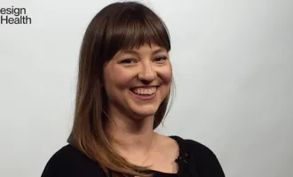
Meet Jessica Murray, an inaugural graduate of the M.A. in Design focused on Health and a former design fellow at the Design Institute for Health.
For Announcements/Important Copy - Design (Big Text)
For Announcements/Important Copy - Design (Normal)
For Announcements/Important Copy - AET (Big Text)
For Announcements/Important Copy - AET (Normal)
Important Info Block
Alternatively, you can use basic block variations to call out important info on a page.
Application Deadline Approaching
Flex Content Areas
We use Flex Content Areas across the website, particularly on the program pages to give an overview of our offerings:
Flex Content Area Example
Flex Content Area Variation 1
As of now, we only use Flex Content Variations for important info & CTAs without imagery.
Flex Content Area Variation 2
As of now, we only use Flex Content Variations for important info & CTAs without imagery.
Below demonstrates Blocks added into a Section that is 4 Columns (25%, 25%, 25%, 25%). Currently the only instance of this is on the Home page.
Additional Tips
Some of these links go to older instruction with screenshots that might not look quite right but, with that understanding, the information should still be helpful. We'll be getting it all updated asap.
- Buttons in the Rich Text editor
- Create a Link
- Telephone Links
- Great Links
- Source Code, HTML
- Great Headings
- Acronyms & Abbreviations
- Foreign Languages
- Documents, files, Word, PDF
- Long word wrapping
- Menus, Navigation & Paths
- Responsive Web Design, Large & Small Devices
- Site Search
- Clearing the browser cache or memory
- Content Management System Infrastructure
- Test site, Sandbox
- Image Optimization
- Research & Analysis
- Analytics & Visitor Data
- Increase traffic, visitors
- Evaluate & Test webpages
- Alternate Text descriptions
- Use of Color & Color Contrast
- Captions, Audio Description and Transcripts
- Hide on Mobile
- Hide on Desktop


